
A useful review begins with the room itself. Mark the table centres, banquette edges, artwork, circulation routes and important sight lines on the plan before discussing a fitting’s shape. Beam angle then becomes a practical design question. A narrow beam concentrates light in a small pool, while a wider beam covers more area with a softer transition at the edges. If a pendant sits between tables rather than over them, its output may create bright patches in the wrong places. Moving the fitting, changing the optic or revising the number of fittings can be cheaper than replacing an entire installation later.
A conversation with bespoke lighting manufacturers should cover performance as well as finish. Share ceiling heights, reflected ceiling plans, furniture layouts and photographs of the materials being used. The manufacturer can then assess the shade opening, diffuser and lamp position together. A diffuser softens and spreads light, but its material and density affect output as well as appearance. Opal glass, clear glass, fabric and perforated metal each produce a different balance of transmission, shadow and brightness. Requesting a sample or small prototype often exposes a problem that a rendered image conceals.
Colour temperature is another specification that needs context. It describes the apparent warmth or coolness of white light and is measured in kelvins. Lower values generally look warmer, while higher values generally look cooler, though the result also depends on the room’s finishes and the light source. Colour rendering is separate. The colour rendering index, or CRI, is an indication of how accurately a source shows colours against a reference. That matters over a dining table, beside a painted wall or near artwork. A project team should record the agreed lamp characteristics in the lighting schedule instead of relying on a verbal description such as warm white.
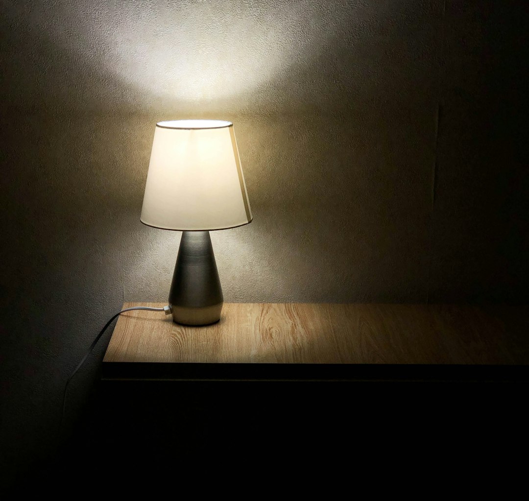
A private hallway can expose a different weakness. Wall lights may be evenly spaced, yet bare lamps or shiny shades can create sharp points of brightness that remain uncomfortable as someone walks past. Glare is not simply a high light level. It is brightness in an unwanted part of the field of view, so the observer’s position matters. Test a typical section from standing and seated eye levels, especially near stairs, mirrors and doorways. Shielding, a deeper shade or a more diffuse source may improve comfort. Spacing can then be adjusted after the first section has been installed rather than copied across the whole corridor.
Brightness should also be described with the right measurement. Lumens indicate the total visible light emitted by a source, while lux indicates the light reaching a particular surface. A room can contain plenty of lumens and still leave a worktop, table or artwork underlit if the output is aimed elsewhere. Dimming adds another layer of coordination. The lamp, driver and control equipment must be compatible, or the system may flicker, respond unevenly or hum. Before manufacture, ask the electrical contractor to confirm the control method, driver location and wiring requirements. Keeping that confirmation with the approved fitting drawing prevents a last-minute substitution on site.
The visible construction deserves equal attention. A cable’s position, canopy size, metal finish and shade proportion can change the way a fitting sits within the interior. A pendant above a long dining table may need a different scale or suspension height from one above a small breakfast table. In a period property, discreet fixings may preserve original cornices and joinery. In a contemporary interior, a visible bracket or frame may be intentionally exposed. A useful habit is to review the fitting beside physical samples of paint, timber, stone and fabric under the proposed light source. Surface reflections often look different on site than on a computer screen.
Before approval, use a mock-up or temporary installation to check glare, shadows, reflections, cleaning access and lamp replacement. Include the maintenance team or person responsible for the property in that review; a fitting that looks right but cannot be reached safely will create an avoidable problem. Keep the final schedule, control notes and approved material samples together with the installation drawings. Project teams seeking lighting layout and control advice can use those documents to frame a more useful discussion. The strongest result is not just a distinctive fitting, but one that puts light where people need it and remains practical after opening day.